How to Quickly Improve Your Shot – Part 1: Camera Height

In my years behind the camera I have found there are several ways to improve a shot dramatically with a few simple tweaks that anybody can do. This is one of those minor tweaks that I wish I had found when surfing the various blogs out there. But if you’re paying close attention to what makes a shot look good you can discover many of these tid bits that can make your work shine on your own.

Camera Height

Here’s one that I notice many people not taking advantage of and it can change many an average shot into an awesome cinematic image: the height of your camera when you hit that record button.

A simple little thing like placing the camera down low and angling it higher can instantly make a shot impressive. Check out the video below where I walk you through a very ordinary scene and we’ll view if together from 4 different camera heights.

Below are all 4 camera heights plus a before and after of eye level versus floor level of the same scene.

Before After

Eye Level vs Floor Level

Eyelevel

Camera Height: Eye Level

Waistlevel

Camera Height: Waist Level

Camera Height: Knee Level

Camera Height: Knee Level

FLoorlevel

Camera Height: Floor Level

IS CAMERA HEIGHT SOMETHING YOU PAY ATTENTION TO?

WHICH CAMERA HEIGHT DID YOU LIKE THE BEST?

LET US KNOW BELOW!


  • JH

    So I’m thinking floor level is when you are trying to communicate something dynamic. But Knee level kind of gives a pop without being too obvious about it. At least from looking at the photos here. I’ve just figured out recently that the easiest way to make nature photos look good is to do just about anything but eye level.

    • coachaviv

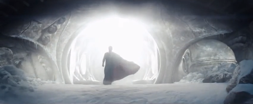
      Love it J. I think you nailed it. I’m a sucker for that floor level (or at least almost floor level) angle, but I agree that knee level gives it that nice “pop” as you said. I would guess the Superman shot I used in the beginning is just that, knee level.

  • The book “Cinematic Storytelling” shows a great use of camera angling in Psycho where Hitchcock switches back and forth between a high angle and low angle.

    The high angle, looking down on a young woman as she approaches the hotel accomplishes two things- 1) Making her appear vulnerable (a high angle is usually used to give that impression, making the subject seem small and everything else above them) 2) Making us feel like she is being watched, like maybe it’s a POV from the hotel

    Then the low angle, looking up at the hotel, makes it seem big and ominous, and overpowering her. The back-and-forth between the two builds the suspense (he then cuts back to the high angle on her, but she’s much closer to camera, like she’s about to get into it)

    I think the most important thing is the story and whatever technique serves that is the best, I do admit from a purely aesthetic point of view I like the low angle look- makes the subject really powerful. One interesting use of it is to have a secondary subject in the background to contrast, even though it will be overpowered, like this photo from Stanley Kubrick (when he was a staff photographer, before he was a filmmaker): https://twistedsifter.files.wordpress.com/2011/12/photographs-by-stanley-kubrick-look-magazine-life-in-new-york-40s-7.jpg

  • coachaviv

    Nice stuff David. “I do admit from a purely aesthetic point of view I like the low angle look.” That is basically my focus here on the site.

    Of course, to fully make a film properly, all the aspects you refer to need to be considered.

  • What are the other simple techniques you know? Will you be doing a blog post on them?

    • coachaviv

      I hope to do more of these type of cinematography Tutorials. Simple but effective, and often never discussed.

  • Micah

    Great post! Such a critical point and one so often ignored. Thanks for this!

  • Pingback: Camera height makes a difference | Life in General()

  • Robert Provencher

    Awesome! Great tips and advice..even for my group of still shootters…thanks for this…Rob Provencher

    • coachaviv

      Thanks Rob! I’m glad it helps.

  • Wayne

    Good to be reminded of these simple, yet essential techniques.

    Keep ’em coming!

  • Wayne

    Just a word on the Superman image – it may not be the best example to have used since it’s not strictly a low-angle shot.

    I could be wrong here, but it actually looks as if the area where the camera is placed is lower than where Superman is standing – ie, it appears as if the camera is at the bottom of a little embankment.

    So, whilst the shot is, indeed, *lower* than the subject, this particular shot is more a function of the terrain, then the camera being shot at the subject or cameraman’s knee height, as suggested in your video.

    Nitpicky, I know – but wanted to point it out all the same.

    • coachaviv

      Wayne, that could be so, very interesting! Nonetheless, the result is the same. The “look” that the low angle gives is what I’m focused on, and you may very well be pointing out another factor that could create it. In the end, it has the result I’m after. It’s all about that long stretch of foreground leading up to the subject!

  • Wayne

    Yup

  • Bobkat

    Awesome Aviv, always a pleasure read ur post. Gonna inculcate this in my shots ASAP 🙂

    • coachaviv

      Bob, your gonna love what it does for your shots!

  • fan

    I am really liking this site i wish i found it earlier !!!!!!!!!!!

    • coachaviv

      Thanks man! Glad to have you on board!